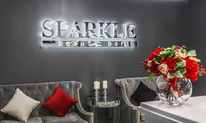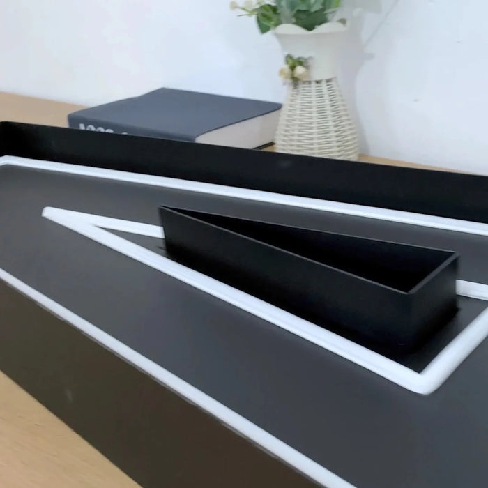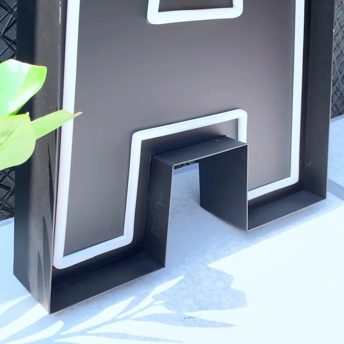
Front-lit is the storefront default: a lit acrylic face, most legible from a distance, what most landlords expect. Open-face leaves the tube visible for maximum character, best for bars, barbers and specialty retail. Halo backlit throws light onto the wall behind a solid face, understated and premium, but only works if the wall behind it is clean. Trimless is front-lit with the visible edge removed, seamless and the most expensive to build.
The construction decision comes before font and color, and it drives how your storefront reads more than either of them.
What a channel letter actually is
The materials are more standardized than most buyers realize. Returns are typically aluminum, and .040 inch aluminum coil is the common gauge for standard front-lit construction. Faces are usually 3/16 inch cast acrylic, with 1/8 inch also standard. Return depth generally runs 3 to 8 inches, with 5 inches the most common, though landlords frequently narrow that range in their own criteria.
Knowing these numbers is useful when you compare quotes. A supplier working in noticeably lighter material is not building the same product, and depth is one of the first things a landlord will check against their tenant criteria.
The four types at a glance
| Open-face | Front-lit | Halo backlit | Trimless | |
|---|---|---|---|---|
| What you see | The tube itself | A glowing face | A glow around the letter | A seamless glowing face |
| Character | Highest | Neutral | Quiet, premium | Refined |
| Legibility at distance | Good | Best | Weakest | Best |
| Needs a clean wall behind | No | No | Yes, critical | No |
| Typical buyer | Bar, barber, tattoo | Retail, franchise, food | Lobby, clinic, studio | Fashion, luxury |
| Relative cost | Higher | Baseline | Higher | Highest |
Front-lit channel letters
Front-lit is boring the way good work boots are boring. The face lights evenly, the letters read from a distance, brand color can be matched precisely, and nobody at the leasing office asks a question. It is the construction most tenant sign criteria assume by default.
Choose it when people read your name from a moving car, when brand color has to match exactly, or when you are rolling out multiple locations and consistency matters more than character.
Open-face channel letters
This is the construction people mean when they say a sign looks like real neon, because it is. The returns frame the tube and cast a shadow, which gives open-face a depth a flat lit face cannot reproduce. The metal shell also carries the brand in daylight, so you are effectively paying for two signs.
Where it falls down: it is too much personality for a corporate brand, legibility at speed is good rather than best, and some landlords push back on exposed tube. Ask before you fall in love with it.
If your storefront competes on character rather than convenience, a bar, a barbershop, a tattoo studio, a specialty cafe, open-face is usually worth the premium. It is also the only one of the four that people photograph on purpose. If you are a franchise, do not fight your brand standards to get it.
See open-face neon channel letters
Halo backlit letters, and the catch
Halo only works if the wall behind it works. The glow lands on that surface, so the surface becomes part of the sign. Clean plaster, flat stone, brushed metal all look excellent. Rough brick, busy tile, or a wall with a downpipe running through it means you have spent a lot of money lighting up your building's flaws.
Standoff distance is a real design lever rather than a detail: shorter gives a tighter brighter halo, longer gives a softer wider dimmer one. It also means the sign projects from the wall, so check your landlord's projection limit before specifying it.
Trimless channel letters
On a standard front-lit letter, look closely and you will see a thin border where the face meets the sides. Trimless removes it. The difference is small on paper and considerable in person: a trimless letter looks machined, a standard one looks assembled.
You pay for that in tolerances, which is why trimless is the construction where the gap between a careful fabricator and a cheap one shows up most obviously. Trade guidance generally puts trimless at its best between roughly 6 and 28 inches tall, and advises against it much above 48 inches without additional structural support.
How the letters attach, and why landlords care
Three methods, and the choice is often made for you by the lease rather than by preference.
- ✓ Raceway. An enclosed aluminum box mounted to the wall that houses power supplies and wiring, with the letters attached to it. One unit, one point of building penetration.
- ✓ Direct or flush mount. Each letter fastened individually, wiring routed through the wall. Cleanest appearance, most penetrations, most invasive install.
- ✓ Wireway. A slimmer enclosure, roughly 2 inches deep against a raceway's 4.5 to 7 inches, carrying wiring but not power supplies. Lower profile, harder to service.
UL: what the label actually certifies
This is worth getting right because it is commonly blurred in quotes.
UL 48 is the safety standard for electric signs, covering the sign as an assembled product. Separately, UL 879 and related standards cover individual sign components, and UL 2161 covers neon transformers and power supplies. NEC Article 600.3 is why it matters at all: electric signs generally must be listed and installed per that listing, which is what an inspector is looking for.
We build with UL-standard components. If your jurisdiction or landlord requires a listed assembly with the label applied, tell us at quote stage so it is specified from the start rather than discovered at inspection.
One live wrinkle worth knowing: as of July 2024 UL narrowed what counts as a separately labeled sign section, so individually wired letters on low-voltage circuits no longer necessarily need a mark on every letter. Not every local inspector is aware of the change, and compliant signs have been questioned over it.
How to choose: four questions
Work through these in order. The first one that gives a hard answer usually decides it.
- How far away is your customer when they need to read it? Across a street or from a car points to front-lit or trimless. At the door or already inside opens up open-face and halo.
- What is behind the letters? If the wall is anything less than clean and flat, halo is out. This eliminates halo more often than budget does.
- Is your brand competing on character or convenience? Character points to open-face. Convenience points to front-lit.
- What do your tenant criteria and local code already allow? Look at the neighbors. If nothing on the block has exposed tube, expect a conversation.
Get a drawing before you commit
Send the logo with a photo of the actual facade, not a rendering on a neutral background. We will come back with letter heights, depths, finish, mounting method and a written price, and if we think the construction you have asked for is wrong for that wall we will say so before you spend anything.
Get a free quote, or browse all channel letter types to compare finished work.
Frequently asked questions
What is the difference between open-face and front-lit channel letters?
Open-face letters leave the tube visible inside the metal channel, so you see the tube itself glowing, whether that tube is glass neon or LED neon. Front-lit letters cover the channel with a translucent acrylic face held by a trim cap, so what glows is the face. Open-face carries more character and depth; front-lit is more legible from a distance and is what most landlords and franchise standards expect.
Which channel letter type is best for a storefront?
For most street-facing storefronts, front-lit, because it is the most legible from a distance and the least likely to cause friction with a landlord. Choose open-face when your brand competes on character rather than convenience, such as a bar, barbershop or specialty cafe. Halo backlit suits lobbies and interiors better than busy street frontage. If you are also weighing a single lit panel across the whole shopfront, channel letters and light box signs compare on different terms again.
What is a trim cap?
A trim cap is the narrow retainer strip bonded around the perimeter of a channel letter where the acrylic face meets the aluminum return. It holds the face in place and finishes the seam. It is commonly supplied in 3/4, 1 and 2 inch widths, and the trade often refers to it by the legacy brand name Jewelite. A trimless letter is one built without it.
How deep are channel letters?
Return depth commonly runs 3 to 8 inches, with 5 inches the most typical for storefront work. Depth generally scales with letter height, and it is frequently constrained further by landlord tenant criteria or by a projection limit in the lease, so it is worth checking those before the depth is fixed.
Does a UL Listed sign mean the same thing as UL components?
No. UL 48 certifies the assembled sign as a product, while other standards certify individual components. A sign built entirely from UL-recognized parts is not automatically a UL Listed sign, because listing the finished assembly is a separate certification that only a fabricator enrolled in a UL program may mark. If a quote says UL components, that is a narrower claim than UL Listed sign, and an inspector may be asking for the latter. If your site needs a listed assembly, say so when you request a quote so it is specified from the start.
Why do some landlords require a raceway and others ban it?
Both are protecting the building facade and reaching opposite conclusions. Landlords who mandate raceways want the fewest possible penetrations of the building envelope and a clean removal at tenant turnover. Landlords who ban them want the flattest possible facade and require a slim wireway instead. Because policy genuinely conflicts between properties, read the tenant sign criteria for your specific site rather than assuming an industry standard, and check what your local sign permit process requires at the same time.
We have made neon since 1998, and we still make it ourselves. If something here does not answer your question, ask us.