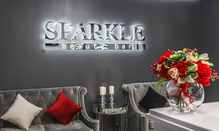
Front lit letters have a translucent acrylic face with LEDs behind it, so the whole letter glows evenly. This is the default storefront sign and the most legible type at night.
Choose it when being seen matters more than looking understated, and when you cannot control what wall the sign goes on.
How it is built
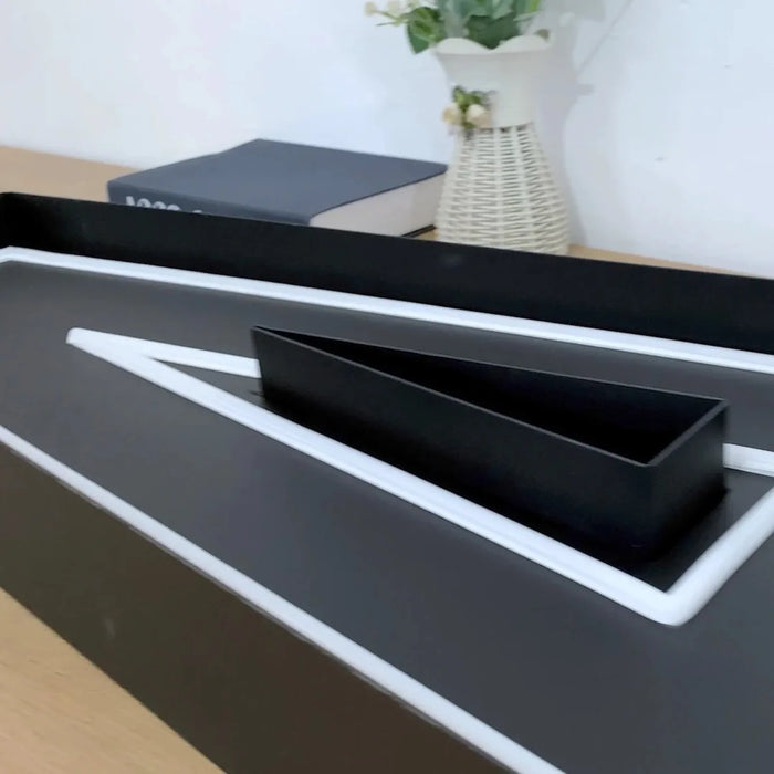
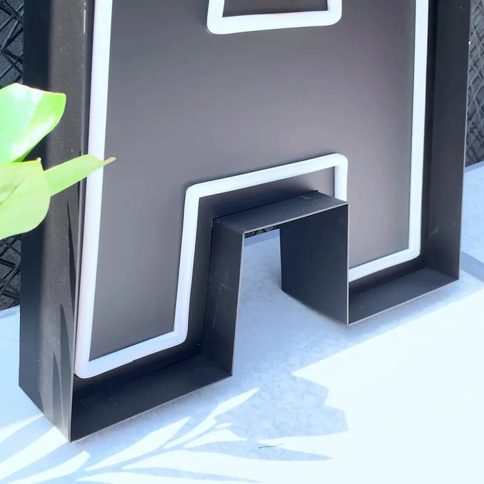
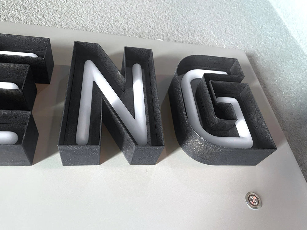
Each letter is a shallow metal can, aluminum or stainless steel, with a returned side wall. LEDs sit inside on the base. The face is a translucent acrylic panel, usually with a colored vinyl or a tinted acrylic to match your brand, held in place by a trim cap around the edge.
Light passes forward through the face, so the letter reads as a solid glowing shape from any angle a customer approaches from.
Why it is the default
- ✓ Works on any wall. Unlike halo, nothing depends on the surface behind it.
- ✓ Legible from the furthest distance. A glowing face beats a glowing outline at range.
- ✓ Reads day and night. The colored face is your brand color in daylight and lit at night.
- ✓ Handles complex letterforms better than halo, because there is no glow to muddle.
- ✓ Color matching is straightforward, because the face is printed or vinyl rather than a light color.
Against the alternatives
| Choose | When |
|---|---|
| Front lit | Maximum legibility, any wall, brand color must be exact |
| Halo | Architectural feel, smooth pale wall, night atmosphere over reach |
| Open face | Vintage character, exposed tube as part of the look |
| Light box | Long wording, complex logos, or a fascia that suits one panel |
Many storefronts combine them: front lit letters for the name, halo for a secondary line, or letters plus a light box for a logo mark that would not survive being cut into individual cans.
Getting the specification right
Letter height is the decision that matters most, because it sets how far away the sign can be read. A rough working guide is that every 25 mm of letter height buys roughly 3 meters of legibility, so a sign read from 30 meters wants letters around 250 mm tall. Local sign regulations may cap this, so check before designing around a height.
Beyond that: send us your logo in the best file you have, a photograph of the fascia, and the overall width available. We will tell you honestly whether the letterform survives being made in this construction.
If you are unsure which type you want, front lit is the safe answer and the one you are least likely to regret. It is the most visible, it works on every building, and it is the only type where your brand color is genuinely your brand color rather than an approximation in light. Choose halo because you want halo, not because you have not seen it done badly.
Frequently asked questions
What are front lit channel letters?
Individual metal letter cans with a translucent acrylic face and LEDs behind it, so the whole letter face glows. They are the standard storefront illuminated letter, and when someone says channel letters without qualifying it, this is usually what they mean.
Are front lit letters brighter than halo letters?
More legible, yes, particularly at distance. A glowing face reads further than a glowing outline, and front lit letters work on any wall while halo depends entirely on the surface behind them. Halo is the more architectural look; front lit is the more visible one.
How tall should my letters be?
As a working guide, every 25 mm of letter height buys roughly 3 meters of legibility, so a sign read from 30 meters wants letters around 250 mm tall. Local sign regulations may cap the height, so check what is permitted before designing around a number.
Can the letters match my exact brand color?
Yes, and this is one of front lit's real advantages. The face is colored acrylic or vinyl rather than colored light, so your brand color is reproduced directly rather than approximated by an LED. Send us your color reference with your enquiry.
What is the trim cap around each letter?
The edge trim that holds the acrylic face into the can. It is visible and usually a contrasting color, reading as a deliberate outline around each letter. Most brands like it, but ask to see it rendered on your own typeface first, because it changes the visual weight of a thin font.
What should I send for a recommendation?
Your logo in the best file you have, a photograph of the fascia or wall, and the overall width available. We will tell you honestly whether your letterform works in this construction before anything is designed.
We have made neon since 1998, and we still make it ourselves. If something here does not answer your question, ask us.