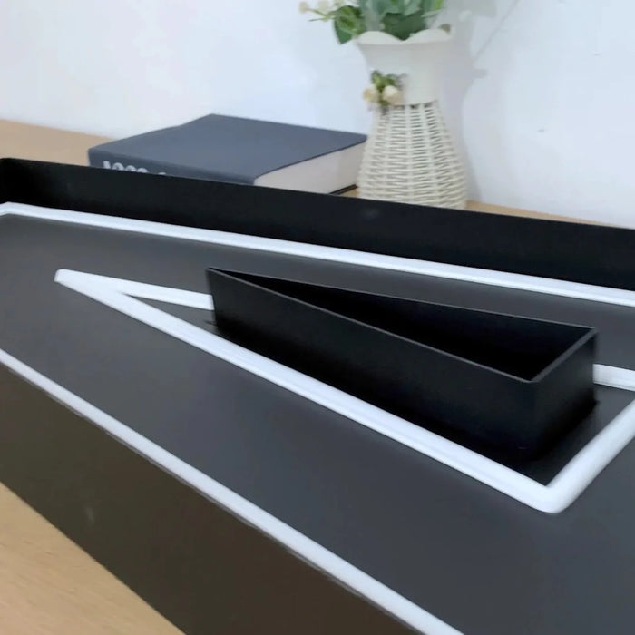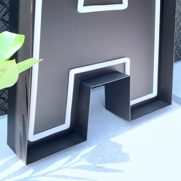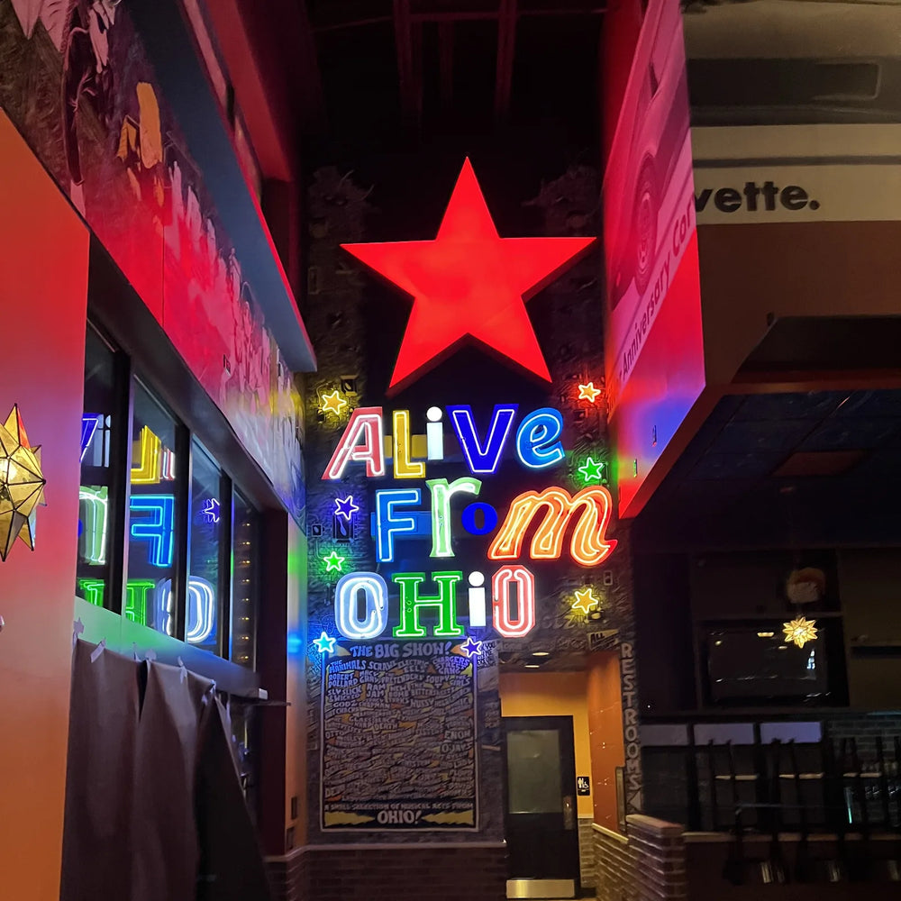
Open face letters leave the light source exposed rather than hidden behind an acrylic panel. You see the tube itself, sitting inside a metal channel.
It is the most characterful of the channel letter types and the most specific in feel. Choose it because you want that look, not because you want maximum reach.
How it differs
A front lit letter hides its light behind a translucent face, so what you see is an evenly glowing shape. An open face letter has no face at all: the metal can holds the tube, and the tube is what you look at.
That single difference changes everything about how it reads. Instead of a flat glowing panel you get a bright line following the letterform, with visible depth and shadow inside the channel.
The honest trade offs
| Open face | Front lit | |
|---|---|---|
| Character | Strong, specific, vintage | Neutral, corporate |
| Legibility at distance | Good, as a bright outline | Better, as a solid shape |
| Daytime appearance | You see the channel and the tube | You see a solid colored face |
| Exposure to weather and dirt | The light source is open | Sealed behind the face |
| Suits fine letterforms | Less well | Better |
Who it suits
- ✓ Bars, diners, barbers, record shops, theatres. Anywhere the brand leans on character.
- ✓ Bold, simple letterforms. Wide strokes give the channel room to work.
- ✓ Sites where the sign is seen up close as well as from the road, because the construction rewards a closer look.
- ✗ Fine or highly detailed typefaces. There is no room inside a narrow channel for the tube to sit properly.
- ✗ Brands where the exact color is non negotiable. Here the color is the light, not a printed face.
Asking about one
Send your logo or wording in the best file you have, a photograph of the fascia, and the overall width available. Tell us if the vintage character is the point, because that changes what we would recommend on stroke weight and letter height.
If you are still deciding between the types, the overview of all four is here.
Open face is a design decision, not a technical one. If you want your storefront to look like it has been there for forty years, nothing else does it as convincingly. If you want the most legible sign per pound of budget on a busy road, front lit letters will outperform it, and there is no shame in wanting that instead.
Frequently asked questions
What are open face channel letters?
Metal letter channels with no acrylic face, so the light source sits exposed inside the channel and is what you actually see. It is how classic storefront signs were built before acrylic faces existed, which is why the type reads as vintage.
Are open face letters less visible than front lit ones?
At distance, slightly. A front lit letter reads as a solid glowing shape while an open face letter reads as a bright outline, and solid shapes carry further. Up close, open face has more depth and character, which is usually why it is chosen.
Do open face letters need more maintenance?
The channel is open, so it collects dust, leaves and sometimes nesting material depending on the site. It is not onerous, but it is a real difference from a sealed front lit letter and worth considering alongside how easily the sign can be reached.
What letterforms suit open face construction?
Bold, simple ones with wide strokes, which give the channel room for the tube to sit properly. Fine or highly detailed typefaces do not work well, because a narrow channel cannot house the light source cleanly.
Can open face letters match my brand color exactly?
Less precisely than front lit letters. Here the color you see is the light itself rather than a printed or vinyl face, so it is chosen from available tube colors rather than matched to a swatch. If exact color matching is non negotiable, front lit is the better construction.
We have made neon since 1998, and we still make it ourselves. If something here does not answer your question, ask us.