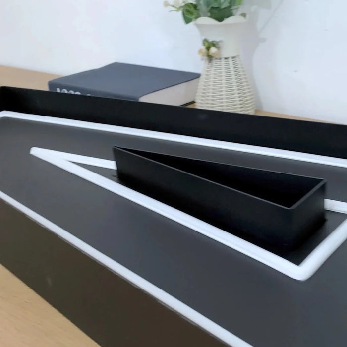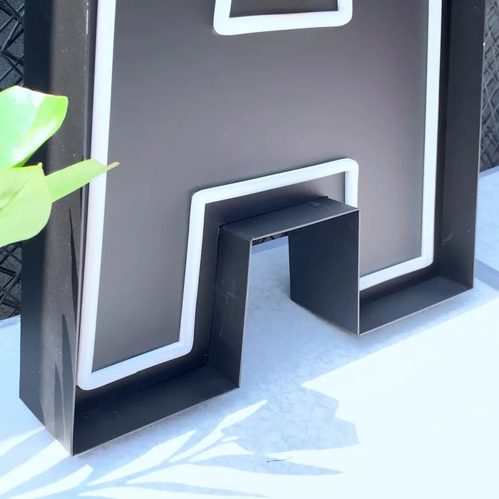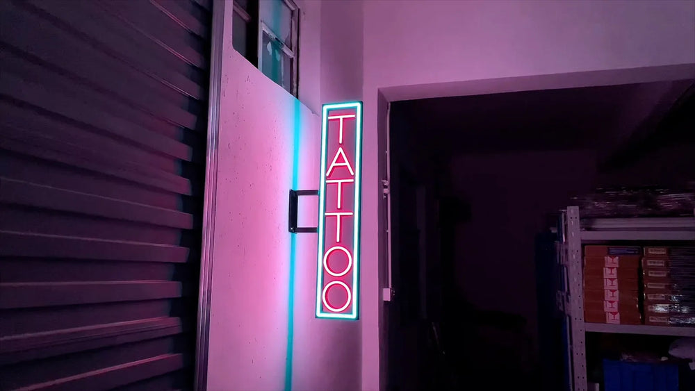
Channel letters are individually fabricated lit letters mounted to the building. A light box is a single illuminated cabinet with your graphics on the face. Electrically and for code purposes they are treated the same.
The real differences: cabinets get cheaper per square foot as they get large, cabinets can carry complex artwork that letters cannot, and many newer developments and historic districts prohibit cabinets outright. There is also one narrow zoning rule that can let channel letters yield visibly larger lettering from the same allowance.
Where they are identical, despite what you may be told
Zoning treatment is also mostly the same: both are measured against the sign area allowance for your district, with one exception covered below.
One popular argument that is marketing, not fact
You will read that channel letters produce better night-time lighting quality because only the letter shapes glow rather than a whole illuminated box. This is repeated widely and it sounds plausible.
It is worth knowing that every source making that specific technical argument is a sign vendor. It does not appear in the sign industry standards material, and it does not appear in the actual landlord criteria and historic district guideline documents that ban cabinets. Those documents simply state an aesthetic preference without offering a technical justification.
We sell both, and we would rather you had the real reason than a flattering one. Channel letters usually do look more considered on a facade, and a lot of people including us prefer them. But "looks better" is an aesthetic judgement, and it is the aesthetic judgement your landlord and your city are making too. Presenting it as a lighting engineering fact is dressing up a taste with a lab coat.
Where cabinets are simply not allowed
This is often the decision, and it is made before you get to weigh anything.
Real tenant sign criteria from shopping centers and retail developments routinely require individually mounted internally illuminated channel letters as the default and list box or cabinet signs as prohibited. The wording is usually explicit, naming lighted sign boxes, cans or cabinets as unacceptable.
Historic districts frequently go the same way for stated aesthetic reasons. One municipal guideline document, for example, describes internally illuminated signage as having a plastic feel that is inappropriate in a historic district, and strongly discourages it.
So before comparing costs, read your tenant criteria and check whether your site sits in a historic or design overlay district. There is more on the two approval layers in do business signs need a permit.
The zoning quirk worth knowing
This pattern recurs across municipal codes but it is not universal, so treat it as a question to ask your local reviewer rather than a rule to rely on. Where it does apply it can be decisive, and it is a genuine legal distinction rather than a preference.
Cost
The industry consensus, which is vendor consensus rather than published cost engineering, is that cabinets become cheaper per square foot as the sign gets large, with the crossover often put somewhere around 40 square feet. Below that, channel letters are competitive. Above it, a cabinet covering the same area generally costs less because it is one fabricated object rather than a dozen.
Channel letters cost more per unit area because each letter is separately fabricated, trimmed, lit and wired. That is also precisely why they look the way they do.
What each one can actually carry
| Channel letters | Light box | |
|---|---|---|
| Complex artwork and gradients | Difficult | Straightforward on a printed face |
| Multiple lines of small copy | Expensive per line | Easy |
| Changing the message later | Refabricate letters | Replace the face only |
| Perceived quality | Higher | Lower |
| Landlord acceptance | Usually the default | Frequently prohibited |
| Cost at large sizes | Higher | Lower |
That fourth row is a real operational advantage for cabinets and it is rarely mentioned. If your business is one where the message or the offer changes, a cabinet lets you replace a printed face rather than rebuild a sign.
Wind load is a real difference at size
A cabinet presents a continuous flat surface to the wind, and published engineering guidance for flexible-face cabinets gives design pressures rising from around 30 pounds per square foot at 90 mph up to roughly 45 at 110 mph for signs at typical storefront heights, with certified structural review required for large faces.
Channel letters present less continuous area, and the common claim is that they therefore carry lower wind loading. That is plausible and we believe it, but we have not found an equivalent published engineering table for letters specifically, so we will not present it as a verified figure. Either way, above your city's threshold a licensed engineer will be sizing the attachment, not a rule of thumb.
How to choose
- Check whether cabinets are permitted at all on your site. Tenant criteria and historic overlays decide this more often than budget does.
- Ask how your city measures sign area for each type. If letters are measured letter by letter, that may buy you a larger word mark.
- Look at your artwork. If it needs gradients, photographs or several lines of small copy, a cabinet does that and letters do not.
- Ask whether the message will change. If yes, a replaceable face is worth real money over the life of the lease.
Get both priced
Send the logo and a photo of the facade. We will tell you which your criteria allow, price both where both are permitted, and say which we would build and why.
Get a free quote, or compare channel letters and light box signs.
Frequently asked questions
What is the difference between channel letters and a light box sign?
Channel letters are individually fabricated three-dimensional lit letters mounted directly to the building. A light box is a single illuminated cabinet with your graphics on the face. Electrically and under the sign safety standards they are treated the same. The differences that matter are cost at large sizes, what artwork each can carry, whether the message needs to change, and whether cabinets are permitted at your site at all.
Why do some developments ban light box signs?
For stated aesthetic reasons. Real tenant sign criteria commonly require individually mounted channel letters and list box or cabinet signs as prohibited, and historic district guidelines often describe internally illuminated cabinets as having a plastic appearance inappropriate to the district. Those documents generally assert a preference rather than a technical justification. Both the landlord layer and the city permit layer are worth checking before you design anything.
Are channel letters better lit than light boxes?
That claim is widely repeated by sign vendors but it does not appear in industry standards material or in the landlord and municipal guideline documents that restrict cabinets. Those documents state an aesthetic preference without technical reasoning. Channel letters generally do look more considered on a facade, but that is an aesthetic judgement rather than a documented lighting performance difference.
Which is cheaper, channel letters or a light box?
Cabinets generally become cheaper per square foot as the sign gets larger, with the crossover often placed somewhere around 40 square feet, because a cabinet is one fabricated object rather than a set of individually built, trimmed, lit and wired letters. At smaller sizes channel letters are competitive. This is industry consensus rather than published cost data, so treat it as a guide, and send us the artwork if you want both priced properly.
Do channel letters give you more sign area than a cabinet?
Sometimes, through a quirk in how area is measured. Some municipal codes measure a cabinet's area as the entire enclosing box while measuring individual channel letters only by the rectangles enclosing the letters, so the space around and between letters does not count. Where that applies, the same zoning allowance yields visibly larger lettering with individual letters, which matters if you are working out how tall your letters need to be to read from the road. It is not universal, so confirm it with your local reviewer.
We have made neon since 1998, and we still make it ourselves. If something here does not answer your question, ask us.