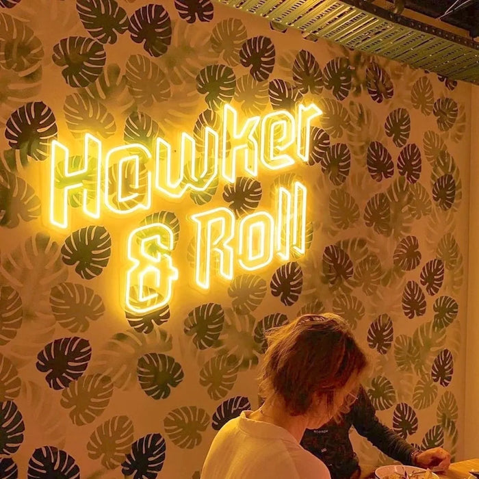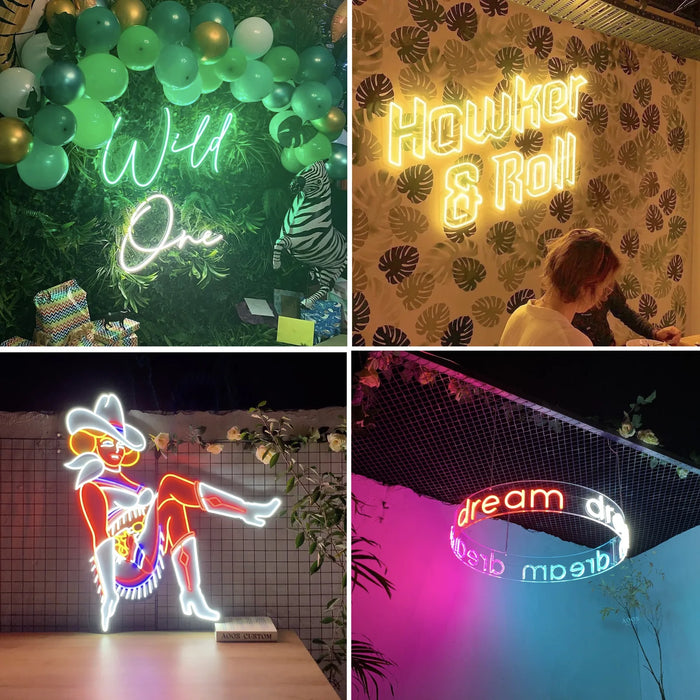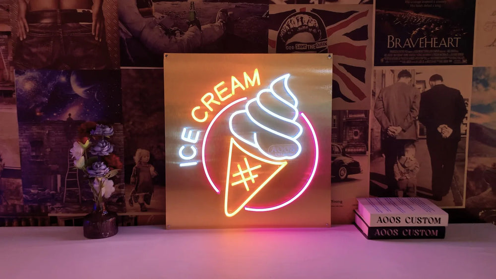
In retail a sign has one job: to be the thing customers photograph and post with your name in it. Design backwards from the photograph.
That means your brand name, at photographable height, on a wall with room to stand back from, in a color that flatters people standing in front of it.
Design backwards from the photo
A retail neon sign that nobody photographs is decoration. One that people stand in front of is distribution. The difference is almost entirely placement.
- ✓ Leave two to three meters of clear floor in front of it. A phone camera needs the distance to fit a person and the sign in one frame.
- ✓ Center it around 150 to 170 cm, so it sits above a standing person's head rather than behind it.
- ✓ Avoid the wall opposite a window, where daylight washes it out for most of the trading day.
- ✓ Check what is around it. Whatever is on that wall goes in every photograph too.
What it should say
| Wording | Verdict |
|---|---|
| Your brand name | Best. Every share carries your name for free |
| Your logo in tube | Strong, if the mark is simple enough to bend |
| A generic phrase | Shareable, but works for someone else's benefit as much as yours |
| Brand name plus handle | Best of both. Handle printed on the board, not in tube |
Where in the store
Fitting rooms are the highest value location in most shops. It is where customers already take photographs, and it is where a flattering light is worth the most.
Behind the till works because every customer faces it during a transaction, though people rarely photograph it.
A dedicated photo corner is the deliberate version, and it earns its floor space in categories where sharing is normal: fashion, beauty, food, gifting.
The window is a different sign with a different job. Size that one for the pavement, not the room, and use a black or no backboard so it reads against daylight.
Practical
Put it on a smart plug tied to trading hours. Mount it out of reach of stock movement and customer traffic, clean with dry microfiber only, and specify which side your outlet is on before it is built, since the cable exit cannot be changed afterwards.
Spend the money on one large sign in the right place rather than three small ones dotted about. Walk the shop with your phone before you decide the wall, take a test photograph of a colleague standing where a customer would stand, and pick the wall where that photo already looks good. The sign only has to add your name to it.
Frequently asked questions
Where should a neon sign go in a retail store?
Somewhere with two to three meters of clear floor in front of it, so a phone can fit a person and the sign in one frame. Fitting rooms, a dedicated photo corner and the wall behind the till are the strongest positions. Avoid the wall opposite a window, where daylight washes it out.
What should a retail neon sign say?
Your brand name. A generic phrase gets shared just as often but does nothing for you when it is. If you want your social handle as well, put the name in tube and the handle on a UV printed backboard, because tube cannot be bent below 5 cm tall.
What color works best in a shop?
Warm White in any area where customers are photographed, because a saturated tube casts its color onto whoever stands near it. Save the strong colors for a window or a wall people photograph without being in the shot themselves.
How high should a retail sign be mounted?
Centered around 150 to 170 cm from the floor, so it sits above a standing person's head rather than directly behind it. Lower and it disappears behind whoever is in the photograph.
Do I need a different sign for the window?
Yes, it is a different job. A window sign is read from the pavement, so it needs to be larger and simpler, with a black or no backboard so it reads against daylight. An interior sign is designed to be stood in front of.
We have made neon since 1998, and we still make it ourselves. If something here does not answer your question, ask us.