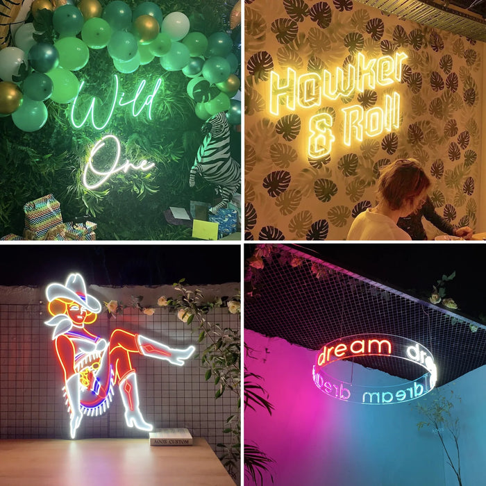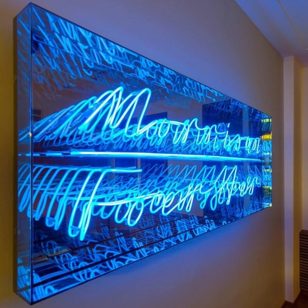
Neon does not need words. A line drawing, an outline or an abstract shape is often the better buy, because it never dates, never gets read twice, and does not tell your guests what to think.
Anything you could draw with one continuous confident pen stroke can be bent.
Why a shape usually outlasts a phrase
Wording is read once and then either agreed with or endured. A shape is looked at rather than read, which is why paintings hold up on a wall for decades and slogans do not.

There is a practical argument too. Words are constrained by the 5 cm minimum letter height, so a phrase forces a certain size. A shape can be almost any proportion, which means it fits walls that wording simply cannot.
What works
- ✓ A single line figure or face. The classic contemporary neon piece.
- ✓ A place outline. A coastline, a mountain range, a skyline, a route.
- ✓ Botanicals. A palm, a monstera leaf, a branch. They suit tall narrow walls that wording cannot fill.
- ✓ Pure geometry. An arc, a circle, a set of parallel lines. The most architectural option.
- ✓ Your own drawing, or a child's. Photograph it flat in daylight and send it.
- ✗ Anything depending on shading or fine detail. That either gets simplified out or moves to a printed backboard.
Backboard choice matters more here
| Backboard | Effect on an art piece |
|---|---|
| Cut to sign outline, clear | The line floats. Purest, and the usual choice |
| No backboard | Even purer, though it complicates mounting |
| Rectangle, black | Reads as a framed work rather than as a sign |
| Mirror | Doubles the line and works unlit as a mirror |
| UV printed | Tube over full color artwork. A different medium entirely |
All five cut shapes and all twelve finishes are included at no extra cost, and any other color can be made to order.

Scale it like art, not like signage
A sign is sized to be read from a distance. A piece of art is sized against the wall and the furniture. Two thirds of the usable width is the usual rule, and it is worth marking the dimensions out in painter's tape and living with them for a day before you commit, because a shape reads larger than wording of the same size.
If you have been staring at phrases for a week and none of them feel right, that is the signal. Send us a drawing or a shape instead. The pieces people still love five years on are almost never the ones that say something; they are the ones that are simply good to look at.

Send a drawing or an idea for a free scaled proof.
Frequently asked questions
Can a neon sign be a shape instead of words?
Yes, and it is often the better choice. A shape is looked at rather than read, so it does not date the way a phrase does, and it is not constrained by the 5 cm minimum letter height, so it fits walls that wording cannot.

What kind of artwork can be made in neon?
Anything you could draw with one continuous confident pen stroke: single line figures, place outlines, botanicals, geometry, your own drawings. What cannot be reproduced is shading, texture and lines that vary in thickness, because tube is a single diameter following a path.
What backboard suits a neon art piece?
Clear cut to the outline is the usual choice, because the line appears to float. Black rectangle reads as a framed work, mirror doubles the line and stays decorative when unlit, and UV print turns it into a different medium altogether. All shapes and finishes are included at no extra cost.
Can I send my own drawing?
Yes. Photograph it flat in daylight, shot straight down rather than at an angle. We redraw it as a bending path and send a scaled proof with dimensions and a firm price before anything is made. Revisions are unlimited and free.
How big should a neon art piece be?
Size it against the wall and the furniture rather than for reading distance, aiming for about two thirds of the usable width. Mark the dimensions out in painter's tape and live with them for a day first, because a shape reads larger than wording of the same size.
We have made neon since 1998, and we still make it ourselves. If something here does not answer your question, ask us.