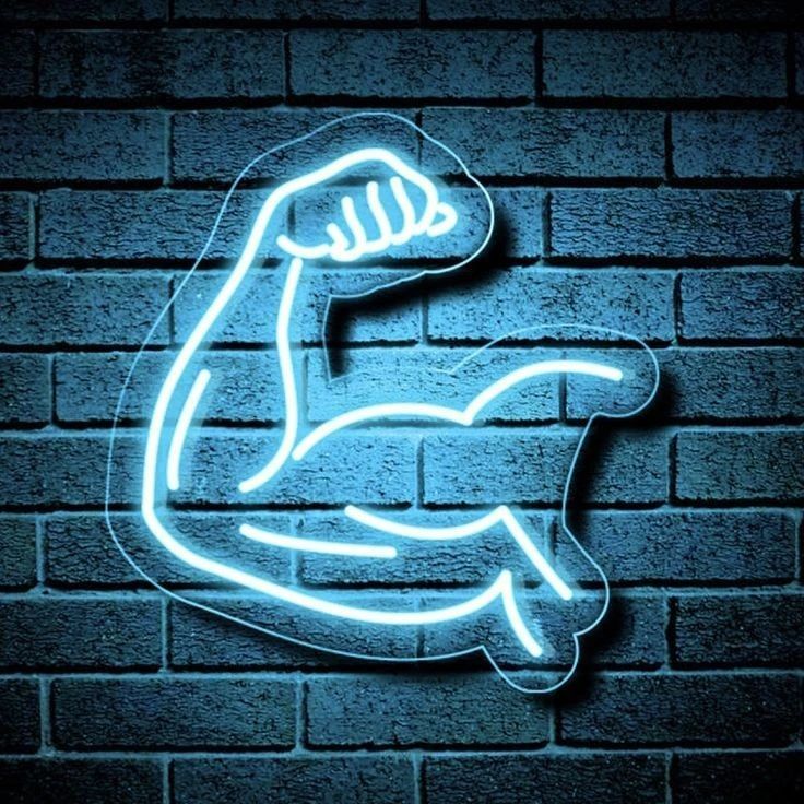
Gym signs are read at a glance by someone out of breath, so keep it to one or two words in an upright font. Script looks lovely and is the wrong choice here.
Mount it where it appears in the mirror, high enough that equipment cannot reach it, and expect it to end up in a lot of phone videos.
Upright, not script
Most rooms suit a script font. A gym does not. The sign is read from across the room, quickly, by someone who is not concentrating on reading. An upright font is more legible at distance, fits more into the same width, and reads as deliberate rather than decorative.
Where to put it
- ✓ Facing the mirror. A gym mirror is where people already look, and it doubles the sign for free.
- ✓ High on the wall, above 180 cm, clear of bars, racks and anything being lifted.
- ✓ Behind the rig or the treadmill, where phone videos are shot.
- ✗ Not at head height near free weights. A dropped plate and an acrylic board is a bad combination.
Color
| Color | In a gym |
|---|---|
| White | Crisp and clean. Reads best against black gym flooring and racks |
| Turquoise, Lemon Yellow | The brightest tubes we make. Hold up under gym lighting |
| Red, Tomato | Aggressive in the right way. Popular in home gyms |
| Deep Blue, Deep Green | Avoid. They are the dimmest tubes and gyms are bright rooms |
Gyms are usually brightly lit, which is exactly the condition where the dimmer colors disappear. If you want dark and moody, dim the room lights rather than choosing a dim tube.
If it is a commercial gym
Use your name, not a motivational phrase. Members film themselves, and a video with your gym's name glowing behind it is advertising you did not pay for. A generic slogan gets shared just as often and does nothing for you when it is.
For a logo with a strapline, put the mark in tube and the strapline on a UV printed backboard, since tube cannot be bent below about 5 cm tall. That costs nothing extra.
One word, upright, white or a bright color, mounted high and facing the mirror. Home gyms are one of the few places where a short aggressive phrase genuinely works, because you chose it for yourself and you are the only one who has to live with it. In a commercial gym, put your name up instead.
Frequently asked questions
What size neon sign suits a home gym?
Letter height of about one tenth of the viewing distance, so a 10 meter gym floor wants letters around 10 cm tall. For one strong word that puts the sign at 80 to 120 cm wide. Size it for the distance it is read from, not for the wall.
What font works best for a gym sign?
An upright font rather than script. The sign is read quickly, from a distance, by someone not concentrating on reading. Upright is more legible at distance and fits more into the same width. Script suits bedrooms and weddings, not gyms.
Where should I mount a sign in a gym?
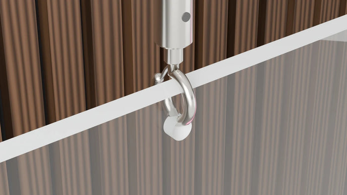
High on the wall, above 180 cm, clear of racks and anything being lifted, and positioned so it lands in the mirror. Avoid head height anywhere near free weights, and use chain or a proper wall fixing rather than adhesive, because gyms have vibration and impact.
What color is best in a brightly lit gym?
White, Turquoise or Lemon Yellow. Those are the brightest tubes and they hold up under gym lighting. Avoid Deep Blue and Deep Green, which put out noticeably less light and disappear in a bright room.
Should a commercial gym sign show the gym name or a slogan?
The name. Members film themselves constantly, and a video with your gym's name glowing behind it works for you every time it is shared. A slogan gets shared just as often and carries no attribution.
We have made neon since 1998, and we still make it ourselves. If something here does not answer your question, ask us.