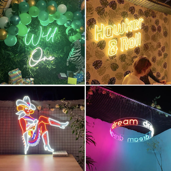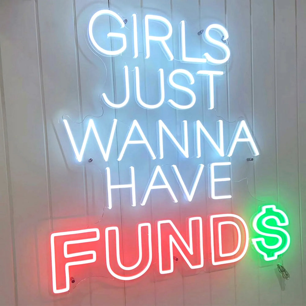
Script fonts photograph best and are what most people picture. Upright fonts are more legible from a distance and fit more words into the same width.
The real constraint is the 5 cm minimum letter height. In a script font the lowercase letters are the shortest thing on the sign, and they are what hits the floor first.
The two families
Script. Connected, handwritten, the classic neon look. Signature is our default and it is what people have in mind when they say neon sign. Script suits names, short phrases and anything that should feel personal.
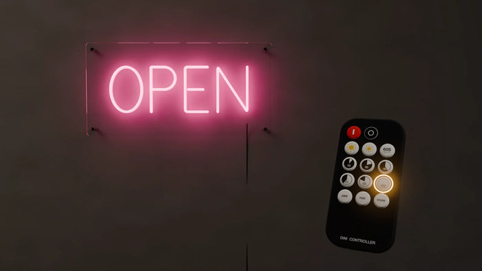
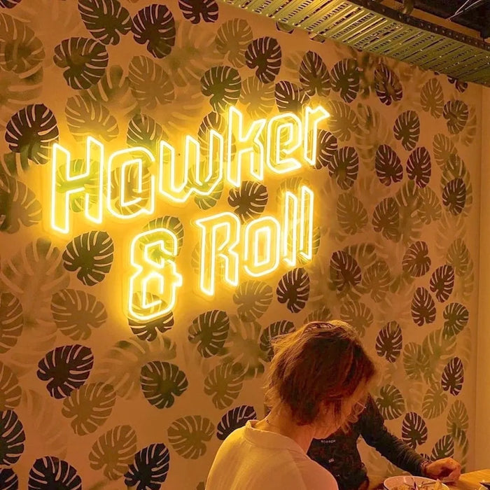
Upright. Separated letters, block or rounded. Reads further, fits more, and looks deliberate rather than romantic. Better for business wording, longer phrases and anything read across a room.
Choosing between them
| If your sign is | Lean |
|---|---|
| A name, or two names | Script |
| Wedding or nursery | Script |
| A business name in a window | Upright |
| More than four words | Upright |
| Read from across a large room | Upright |
| Mostly going to be photographed | Script |
Three things that catch people out
- ✗ Very thin or very ornate fonts. Tube has a physical diameter, 6mm or 8mm typically, so fine hairlines and tight flourishes cannot be reproduced. They get thickened, and the character of the font is lost.
- ✗ All capitals in a script font. Script capitals are designed to be followed by lowercase. A word in all caps script is hard to read and rarely looks intentional.
- ✓ Accents get stripped in the customizer. José previews as Jose. If your wording carries an accent, order through the quote form so we can confirm the character can be bent in your chosen font.
Using your own font
If you have a brand typeface, send it with your quote request. Most fonts can be bent, and where one cannot, it is usually because of hairline strokes rather than the shapes themselves. We will tell you before anything is made, and we will suggest the closest workable alternative rather than silently substituting one.
If you are torn, ask for the drawing in both. It costs nothing and it takes an afternoon, and seeing your own words in both families settles the question far faster than looking at font samples of somebody else's words. Most people who thought they wanted upright choose script, and most people with more than four words end up glad they went the other way.
Frequently asked questions
What font is best for a neon sign?
A script font for names, short phrases and anything that will be photographed, because it gives the classic neon look and reads as personal. An upright font for business wording, longer phrases and signs read from across a room, because it is more legible and fits more into the same width.
Can I use my own font on a neon sign?
Usually yes. Send the typeface with your quote request and we will tell you whether it can be bent before anything is made. The fonts that cause problems are the very thin and very ornate ones, because tube has a real diameter and cannot reproduce a hairline.
Can a neon sign use two different fonts?
Yes, and it costs nothing extra. A name in script with a date or subtitle in a small upright font underneath is one of the most common arrangements we build.
Why does my script font need such a large sign?
Because the lowercase letters set the limit. Nothing below about 5 cm tall can be bent, and in a script font a lowercase letter can be a third the height of the capital. That forces the whole sign up in size. An upright font, where the letters are all roughly equal, fits the same wording into far less height.
Will accented characters work?
The online customizer strips them, so José previews as Jose. That is a limitation of the preview tool. If an accent matters, order through the quote form with the wording typed exactly as it should appear, and we will confirm the character before building.
We have made neon since 1998, and we still make it ourselves. If something here does not answer your question, ask us.